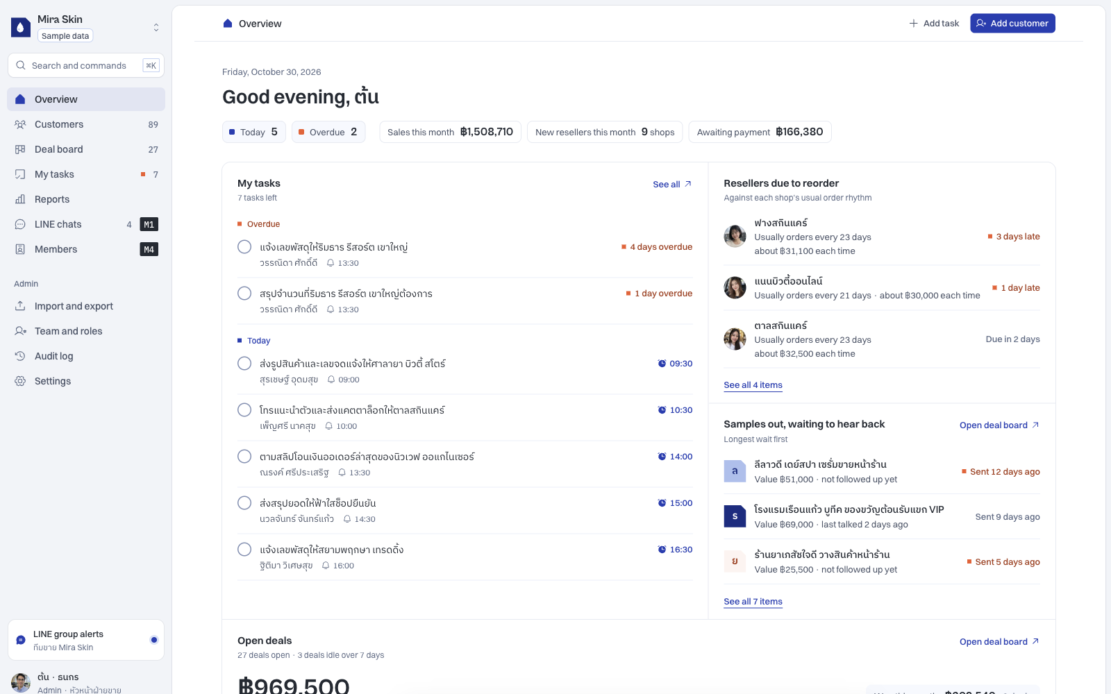
Cover: Layout B in the Talvyn Custom CRM demo. English interface with fictional Thai sample records. The demo’s layout selection applies to the team, rather than providing an individual layout per user.
At nine in the morning, a salesperson opens the CRM to decide which customer to contact first. The first screen contains several charts. Finding the next task means opening the customer menu, filtering a list and checking records one by one.
The information may be there, yet starting a piece of work still takes effort. Repeat that every day and people have a reason to keep a separate task list, then update the CRM later.
Customising a CRM interface should start with a practical question: what does someone need to know or decide on this screen to continue their work? Visual quality matters. Information order and clear actions matter just as much.
Davis’s 1989 study examines perceived usefulness and ease of use in technology acceptance. For a CRM evaluation, these provide two questions: does the screen support necessary work, and can the team understand how to use it?
Start the day with work to do
Use a real morning as the design brief: follow up on samples, confirm an appointment and collect missing information for a quote. The first screen should separate work that needs action today from information people review occasionally.
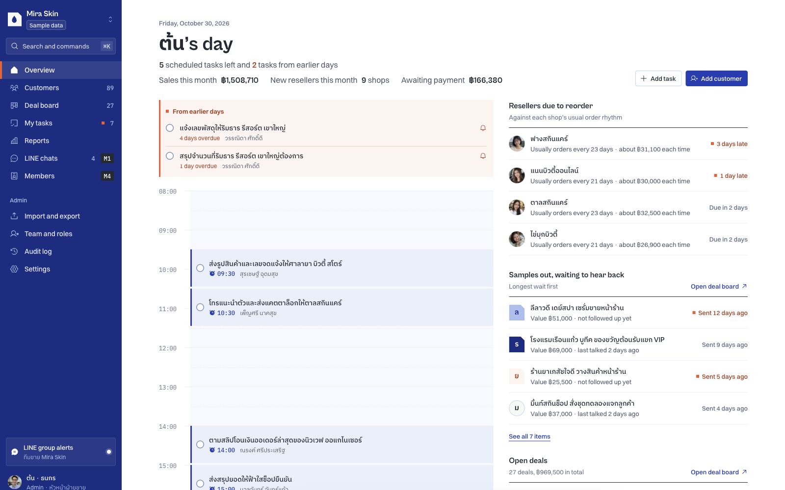
The Talvyn Custom CRM demo offers three interface examples for the same business: a block-based overview, a compact application layout and a daily agenda. They help a team compare starting with information groups against starting with a schedule.
The Mira Skin application view places follow-up work and reseller information close to the overview. A team organised around appointments may prefer the day’s sequence instead.
Choosing a layout is an exercise in making frequently needed information easy to find. Nielsen Norman Group’s recognition-versus-recall guidance explains why relevant information should be visible instead of relying on people to remember it and search again.
Before a customer conversation, bring the context forward
A name and phone number let someone start a call. They do not explain how to continue the previous conversation.
For a reseller sales team, useful context might include product interest, the last contact and a promised sample. For a service team, it might be the location, appointment and preparation needed before a visit.
Start by choosing the few fields people use most often for a table or card. Keep the fuller detail in the profile. This balances quick decisions with access to the complete context.
Talvyn’s demo includes examples of custom fields and table visibility settings. A more substantial screen redesign belongs in the custom scope. “Customisable” should distinguish a supported setting from a change that needs additional development.
When recording work, make the next action clear
People are more likely to understand a form when each field has a visible purpose. A long questionnaire before recording a short conversation can leave data entry behind the actual work.
Separate what is needed at intake from what becomes necessary later. Initial contact may require a reachable channel and a basic need. Delivery conditions may become relevant when a proposal takes shape. The right sequence depends on business requirements, rather than making every form as short as possible.
Microsoft’s form-design documentation focuses on helping users access and enter needed information efficiently. In a CRM, also check what an action means: saving a record, changing a stage and sending something to a customer should be clearly distinguished.
When a manager reviews work, make blockers discoverable
A total customer count can inform the big picture. A manager also needs to know which work is waiting, who owns it and where a decision is needed.
Start with the questions the manager actually asks. Are appointments awaiting confirmation? Is a document request sitting without an owner? Then decide what should appear and how someone can inspect the underlying detail.
Different roles provide useful design requirements, but describe the current product accurately. The demo selects one layout for a team. Separate role-specific screens or information access need to be defined alongside permissions as additional scope.
Test a screen with tasks
Instead of only asking which layout people prefer, give them realistic sample work:
- Find the next customer to contact and explain why.
- Locate the previous conversation’s context without asking a colleague.
- Record the outcome and assign the next action.
- Have a manager identify a blocker and open its detail.
Notice where people pause, interpret terms differently or return to a spreadsheet for missing context. Those observations are more actionable than “make the screen cleaner.” GOV.UK’s guidance for internal services likewise treats employees as users whose needs should shape the service.
Give your team a CRM interface they can work from
If your CRM holds the data but your team still needs separate lists to get work done, bring those screens and tasks to Talvyn Labs. We design Custom CRM interfaces together with the workflow and features they support. Share the current screen and the three tasks your team repeats most often to define a system people can open and work from.
Discuss your custom CRMRelated reading
References
- Talvyn Custom CRM demo, reviewed on 30 October 2026; fictional sample data.
- Nielsen Norman Group: Recognition vs. Recall in User Interfaces.
- Microsoft Learn: Create and design forms.
- GOV.UK: Designing services for government users.
- Davis (1989): Perceived Usefulness, Perceived Ease of Use, and User Acceptance of Information Technology, MIS Quarterly.
External references support design principles. They are not Talvyn usability-test results or evidence of its technology stack. Interface changes beyond the demo’s options require an agreed scope.